Ashley Simonetto
Can you introduce yourself and tell us a little about your design practice?
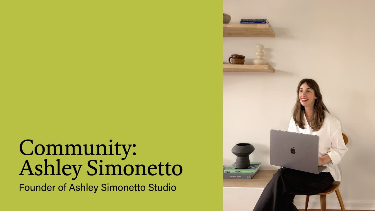
Ashley Simonetto Studio was founded five years ago, and I’m glad to say I haven’t looked back. We build brands across the arts, culture, lifestyle and interior industries, bringing together creative direction, strategy and design through 1:1 collaborations with founders and teams.
My priority is fostering a thoughtful, ego-free approach focused on creating clarity, cohesion and direction to each project. With over a decade of experience working with businesses big and small, we understand their functional realities, resulting in design solutions that are adaptable and built for longevity.
What was your first impression of ArtSupport Australia when we began working together?
My first impression of ArtSupport was that the care and effort put into informing and engaging its creative audience was genuinely considered. Meeting Sophia, the founder, only solidified that. ArtSupport’s platform is rich with engaging content that helps dismantle the barriers around arts institutions, which can often feel inaccessible or difficult to navigate.
What did you feel the new identity needed to communicate?
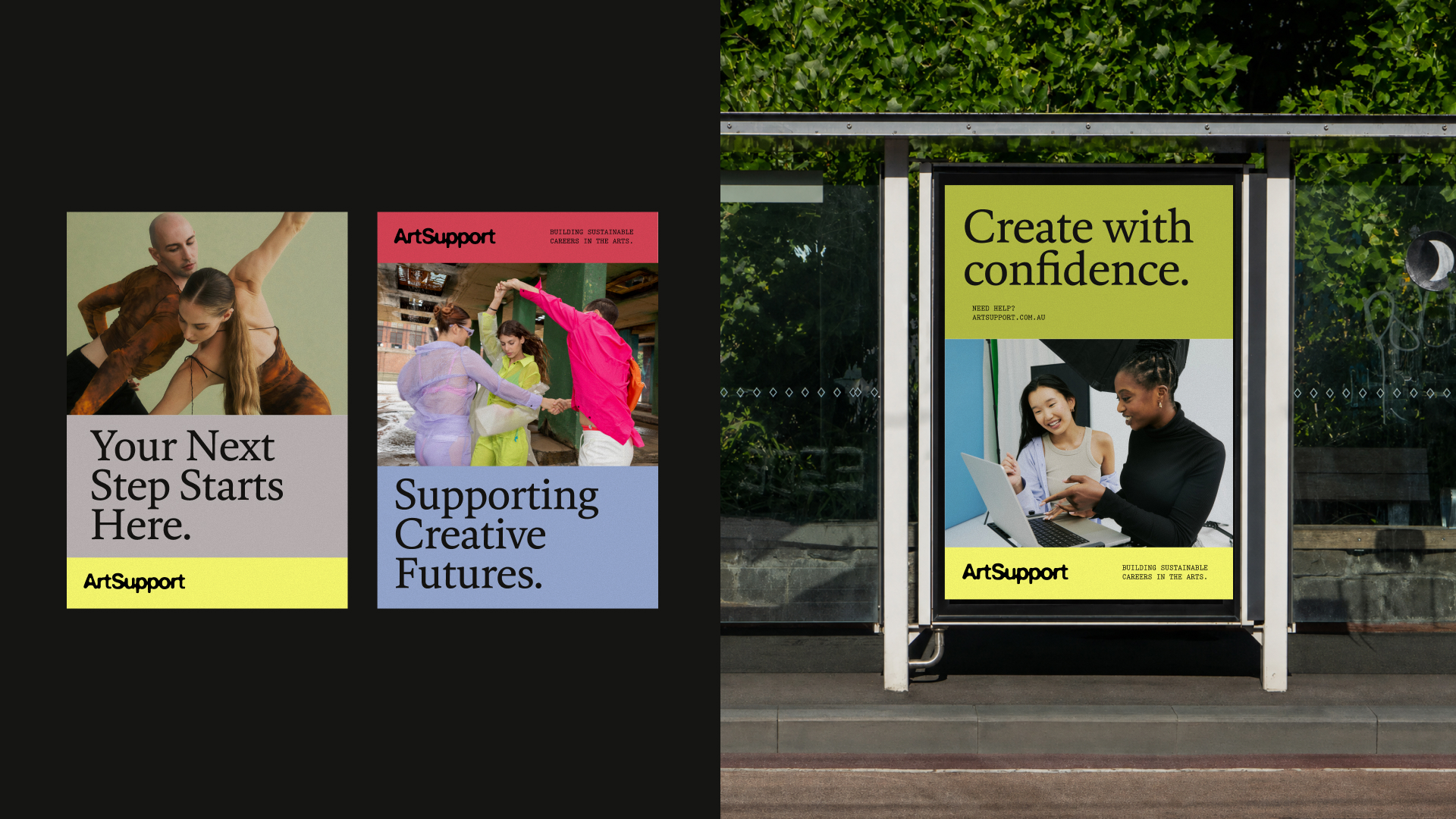
Like most start-up businesses, Sophia felt that the old brand identity, which was created in a low-fi, budget-friendly way, no longer reflected the successful growth and essence of the organisation. I felt it was essential to evolve the brand to feel more energetic, approachable and playful, reflecting the rebellious, tech-savvy, creative side of the platform. It was also important to communicate that ArtSupport is no longer a start-up foundation, but a reputable organisation that can sit comfortably alongside established institutions.
Where did you begin when developing the creative direction for the rebrand?
Like any design process, we began with strategy. Working directly with Sophia to uncover the essence of ArtSupport, its future goals and the challenges it was facing, we were able to establish a clear foundation for the creative direction. These findings gave us the parameters to guide our thinking and shape the visual identity.
What ideas or references influenced the visual identity?
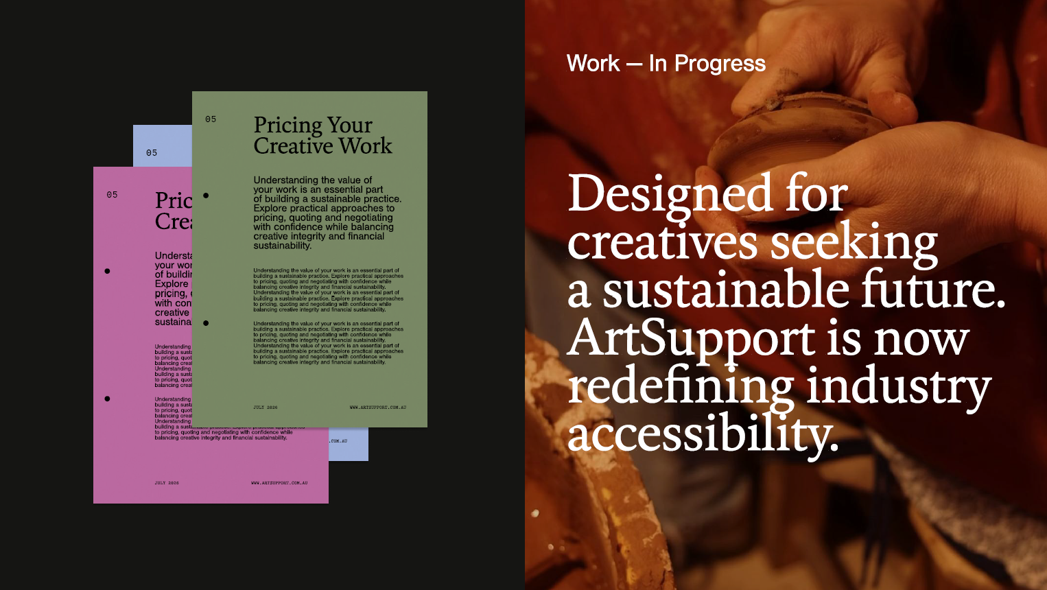
Fundamentally the visual identity was inspired by utilitarian design, stemming from the nostalgia of noticeboards, public bulletins and administrative systems. This was purposefully explored to create a sense of familiarity, and reflect the primary purpose of ArtSupport, which is to communicate various information in an accessible way.
How did the new logo develop, and what does it represent?
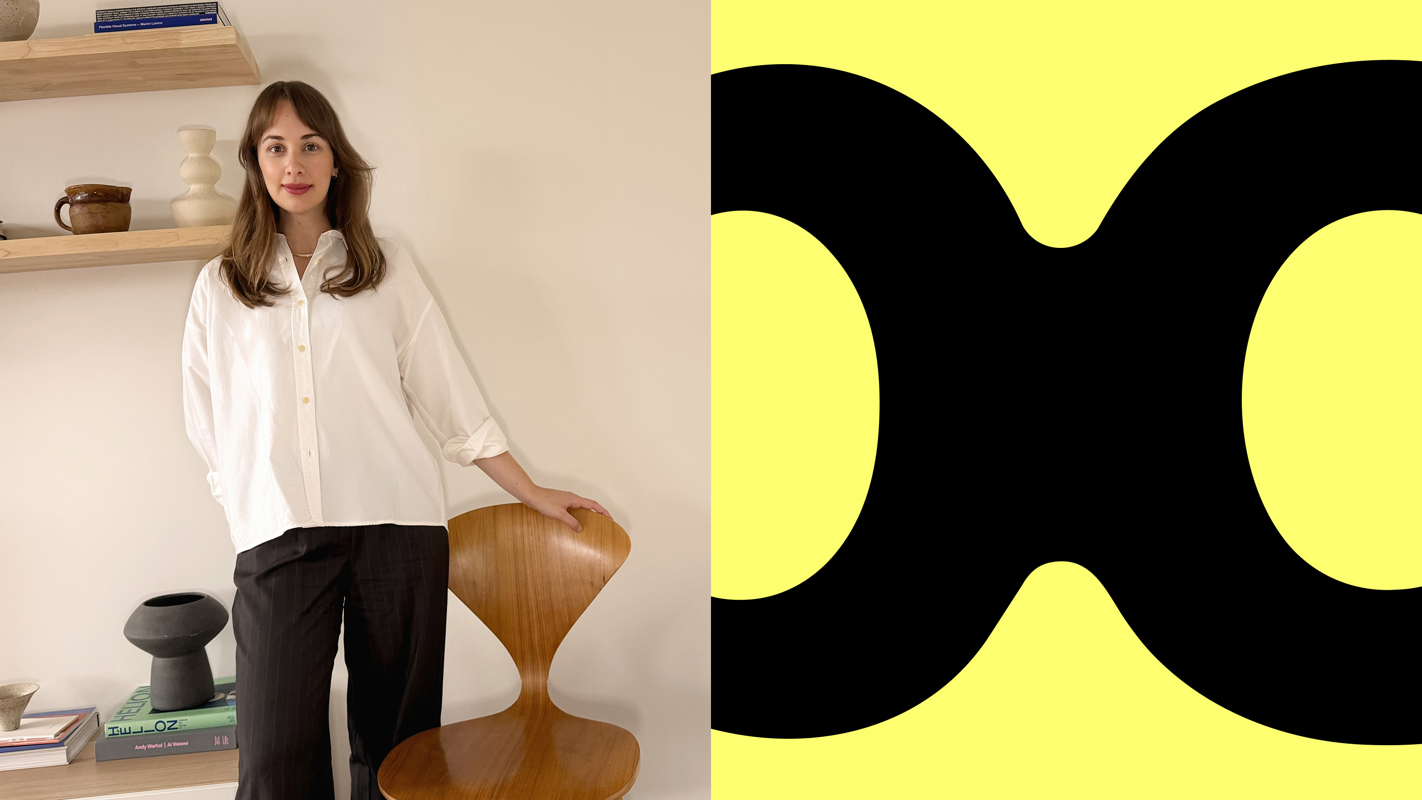
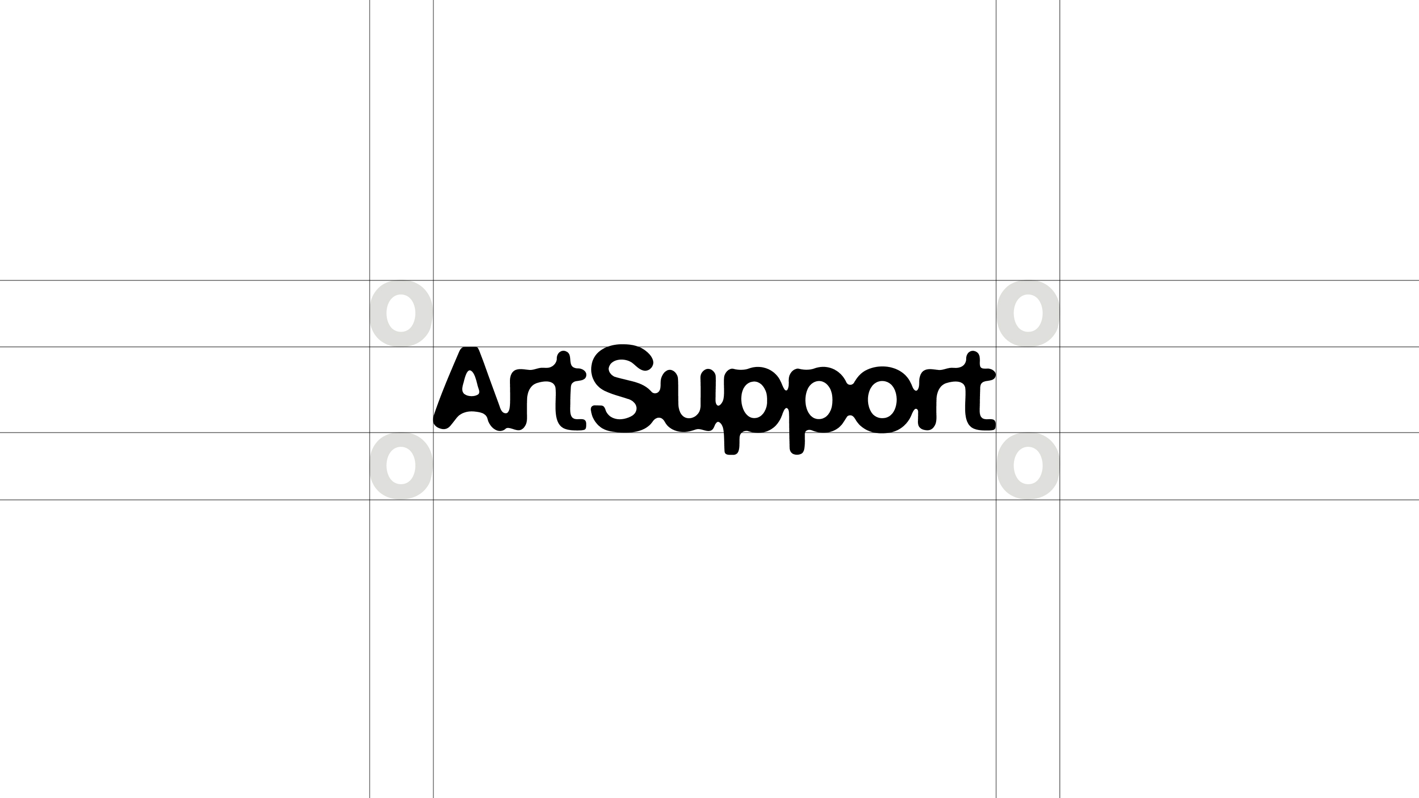
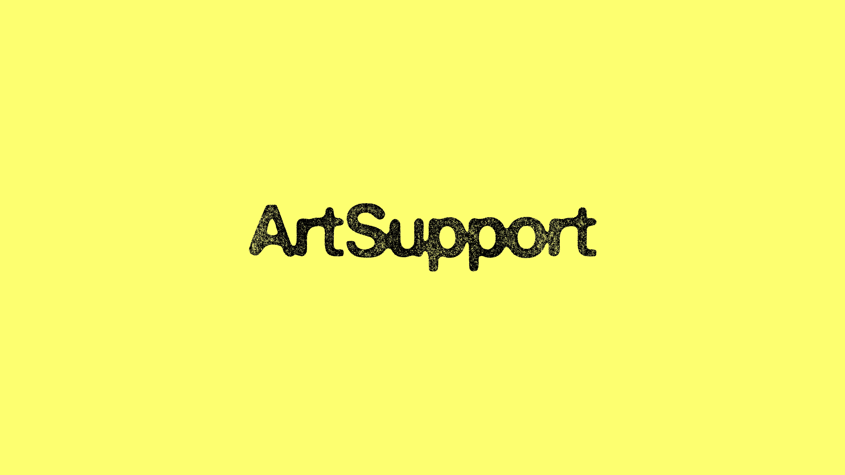
After exploration, development and refinement, the logo evolved into a custom wordmark featuring an ink bleed effect, allowing each letter to gently merge into the next. It represents the coming together of resources, opportunities, knowledge and community, while each unique letter celebrates the individuality and hand of the artist. We explored various text configurations before landing on a unified wordmark that felt strong, distinctive and ownable.
How did you approach developing the new colour palette?
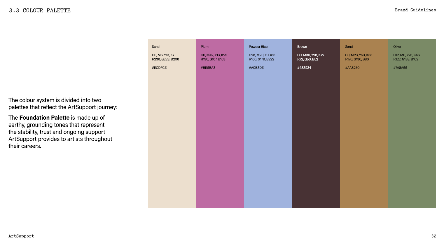
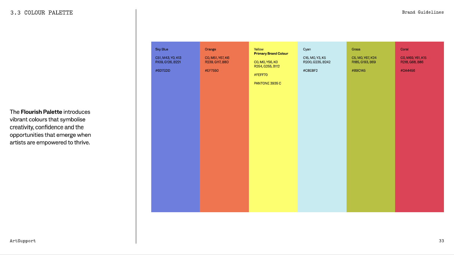
One of Sophia’s main challenges was working with a disjointed colour palette that created confusion and second-guessing every time she created a new asset or content piece. The main priority was creating a colour palette that was flexible and multi faceted, whilst still providing clear structure. The result is a colour system that is divided into two palettes:
The Foundation Palette is made up of earthy, grounding tones that represent the stability, trust and ongoing support ArtSupport provides to artists throughout their careers.
The Flourish Palette introduces vibrant colours that symbolise creativity, confidence and the opportunities that emerge when artists are empowered to thrive.
How did you think about the identity as a broader visual system beyond the logo?
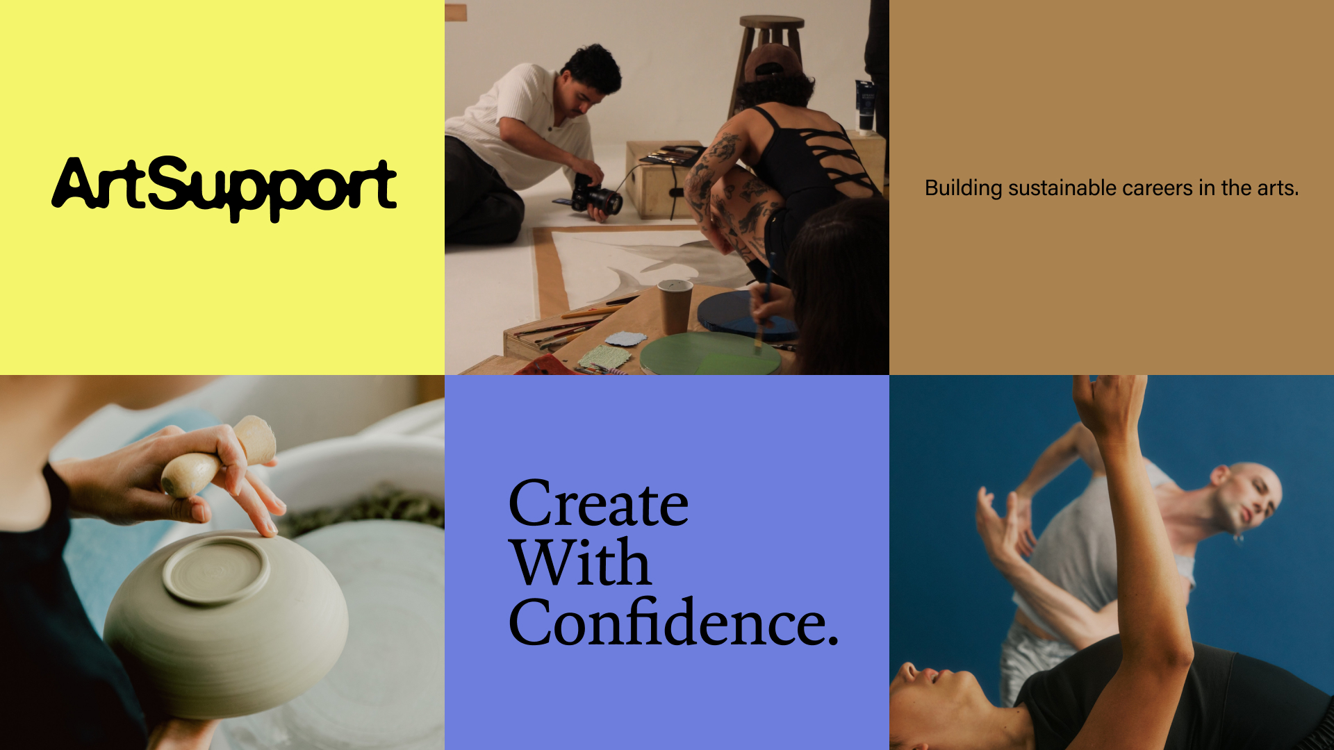
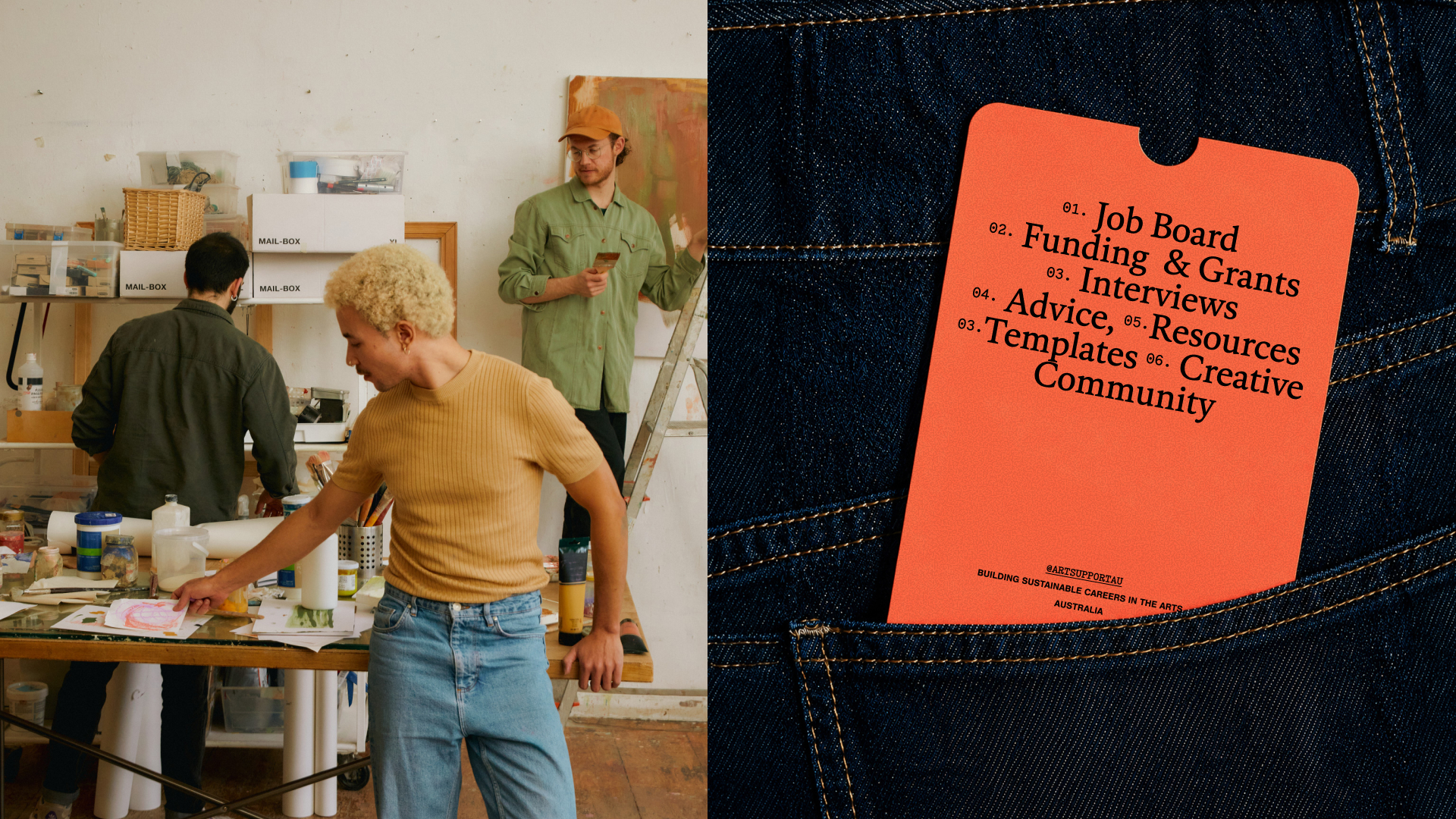
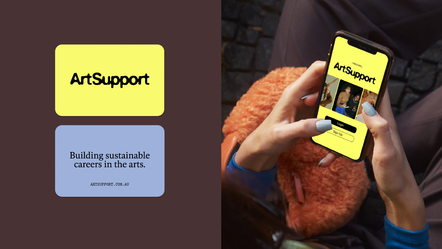
Overall a clear direction and feeling was provided that would allow the ArtSupport team to continue growing and building with confidence. It was important to take into consideration not just the design elements, but consideration of composition, secondary graphics, imagery and video style and typography structure.
Was there a particular moment in the process when the identity started to come together?
Once the colour palette was locked in, everything just clicked!
What did you deliberately want to avoid with the new identity?
We wanted to ensure that while leaning into nostalgic administrative design cues, the brand didn’t feel overly retro. The result is an identity that draws on nostalgia through a contemporary lens, giving it longevity and broader appeal.
What is your favourite element of the finished identity?
Overall I’m proud that we created design elements that balance restraint and playfulness, to create harmony and a strong presence. The typography system is one of my favourite elements, as the trio of fonts work together in harmony and give a sense of familiarity.
What do you hope people take away from the new ArtSupport identity?
That ArtSupport is a platform worth listening to, that understands creatives and is relevant to the now.
How can people connect with you or work with you?
Website: ashleysimonetto.com
Instagram: @ashleysimonetto
Email: [email protected]